








Where to Start
Before anything else, decide on the story. A graduation slideshow presentation that works isn’t a year-by-year timeline of photos. It’s a narrative with a beginning, a middle, and an end. The beginning is who the graduate was as a child. The middle is the journey through school. The end is the moment of achievement and a look forward. Once that arc is clear, the next step is getting a structured slide layout in place. It’s easy to build their decks using Slideonic AI slideshow maker, which generates beautifully formatted slide structures and professionally written text from your raw input or docs. You can upload the graduate’s essays, list of achievements, school reports, or simply describe the chapters, and the tool produces a narrative structure ready for your presentation. Once the AI generates this solid foundation of text and themed layouts, you can easily customize it by inserting your favorite photos and media between the content slides. For a graduation ceremony slideshow with multiple thematic sections, having that text and structural layout generated saves hours of manual work.Photo Selection and Organization
The volume of photos matters. Sixty to eighty images across a ten to fifteen-minute presentation is a workable range. More than that and the pacing slows; fewer and the slideshow feels thin. Selection is the editorial work that separates a good slideshow from a great one. Every photo should earn its place. A shot of the graduate at age five with a gap-toothed smile belongs. A blurry group photo from a party probably doesn’t. The test is simple: does this image advance the story or just add duration? Organize selected photos into folders by chapter before importing anything. A structure like this works across most graduation slideshows:- Early childhood and family
- Elementary and middle school years
- High school milestones, friends, activities
- Senior year
- Graduation day ceremony
- Final slide or forward-looking close
Technical Preparation
Aspect Ratio
Childhood photos are often in 4:3 format. Modern screens display in 16:9. Placing an old square or vertical photo directly on a widescreen slide creates black bars on the sides. The cleanest fix is to use a blurred version of the same photo as the slide background, placing the original photo centered over it. Most presentation tools support this natively. The result looks intentional rather than makeshift.Scanning Old Prints
Paper photos from early childhood need to be digitized. A smartphone app like Google PhotoScan handles glare reduction automatically and produces usable resolution. Scan in good natural light, use the multiple-capture mode to minimize reflections, and save at the highest available quality.Video Clips
Short video clips integrated between photo sections change the rhythm of the slideshow in a way that holds attention. Three to five seconds is the right length. Longer clips shift the focus from the overall narrative to the content of the clip. Keep them as accent pieces: a moment from a sports game, a school performance, a candid hallway interaction.
Pacing and Transitions
A graduation slideshow with music that plays at a flat, mechanical tempo loses the room after the first few minutes. Timing variation is what keeps people watching.
Slide duration by chapter
| Chapter | Recommended Duration |
| Childhood opener | 12-15 seconds |
| School years | 8-10 seconds |
| Senior year | 10-12 seconds |
| Graduation day | 12-15 seconds |
| Final slide | 20+ seconds |
The Ken Burns effect – a slow pan or zoom across a static image, adds movement to milestone photos without video. Use it selectively on the diploma moment, the senior portrait, and the opening childhood image. Cross-dissolve is the right transition for everything else. Avoid complex effects that call attention to the transition rather than the photo.
Transition guide by photo type
| Photo Type | Best Transition | Avoid |
| Childhood opener | Long cross-dissolve | Jump cut |
| Group shots | Standard dissolve | Spin or flip |
| Milestone moments | Ken Burns zoom | Fast cut |
| Senior portrait | Slow fade | Wipe or push |
| Final diploma slide | Fade to black | Any motion effect |
Music
Two to three tracks for the full length of the slideshow is the practical range. The emotional arc of the music should mirror the visual arc: something slower and warm for childhood, building energy through the school years, something celebratory for the graduation sequence.
Personal music – songs that actually meant something during those years – consistently outperforms generic graduation playlists. For public venues or uploaded versions, use royalty-free alternatives from libraries like YouTube Audio Library or Pixabay Music to avoid copyright issues.
Slide timing synchronized to the beats of the track produces a noticeably more polished result. Listen to the track, note where the strong beats fall, and adjust individual slide durations to match. The effect is subtle but the difference is real.
Graduation Slideshow Ideas Worth Borrowing
A few approaches that consistently work well in graduation photo slideshow presentations:
The first day / last day pairing. Side-by-side photos of the first day of kindergarten and the last day of senior year on the same slide. Simple, effective, always lands with the audience.
Teacher or mentor messages. A slide with a quote from a teacher or coach – even just a sentence – adds weight to the academic chapter.
The interview clip. A short video of close friends or family answering “what’s your favorite memory?” breaks up the photo sequence and adds warmth.
Captions on milestone photos. Date, event, a brief note. Keep it to under ten words. Captions provide context without slowing the pacing.
The final quote slide. A meaningful quote from the graduate, in their own words, on the last slide. Hold it on screen for twenty seconds or more. Let the room sit with it.
From Screen to Wall
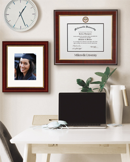
The slideshow ends and the room lights come back on. The photos that carry the most weight from that presentation – the diploma moment, the graduation portrait, the family photo from ceremony day – deserve a more permanent home than a video file.
Framing a diploma alongside a key graduation photo gives those images a place that lasts. Diploma frame collections designed for academic achievements are built for exactly this: preserving the official credential alongside the visual memory of the day. The slideshow tells the whole story. A framed diploma on the wall marks where it ended.
Both are worth doing. They serve different purposes for different audiences – one for the room, one for the years that follow.
Conclusion
A well-built graduation ceremony slideshow is a design project as much as a personal one. Structure first, selection second, technical details third. Get the arc right before touching the software, use an AI slideshow maker to generate the layout foundation, then focus the remaining time on the photos and the music. The result is something that holds the room for the full fifteen minutes and gives the graduate something worth watching again years later.